
← Back to work Graphic & print design
Shelterbox Flyer
Design and typography of an informative, double-sided flyer for ShelterBox Netherlands in collaboration with Rotary. The layout is structured to communicate the urgency of disaster relief clearly, featuring direct donation conversion via an integrated Tikkie QR code.
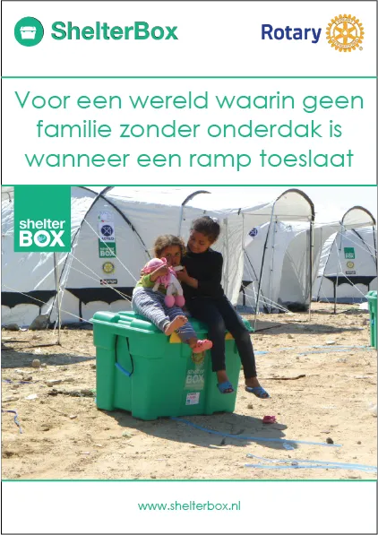
The Approach
- Information Hierarchy & Layout: Structuring complex data regarding global displacement into a clean grid with distinct headings, ensuring the flyer remains easily scannable for the reader.
- Typography & Brand Identity: Maintaining the visual guidelines of both ShelterBox and Rotary, combining clean, legible typography with their recognizable brand colors.
- Conversion Optimization: Strategically positioning the high-impact visual content on the front and the calls-to-action on the back, giving prominent placement to the digital donation options.
The Result
The result is a professional, high-impact flyer that strikes a perfect balance between detailed information and visual breathing room. Thanks to the clear structure and user-friendly QR code integration, the barrier to donate is lowered, while powerfully reinforcing the humanitarian organization’s identity.
Next project Tirisi Social Media ↗ Social media design